

How to Make Engaging, Professional Videos

Create AI videos with 240+ avatars in 160+ languages
Since AI video came along, creating professional-looking videos with really high production value has never been easier.
However, just because a video looks like it was made in a studio doesn't make it engaging.
We're all fighting for eyeballs in the attention economy, and I feel like you now have to really grab your audience to stop them from scrolling past all your hard work.
I've helped to create thousands of videos, and I've learned that engagement is all about signaling value to your viewers as quickly as possible and making your audience feel like you understand them and their pain points.
In my opinion, that's how you get not only clicks and views, but also longer watch times, comments, likes, subscriptions, and shares — real engagement.
In this post I'm going to share with you my 10 hard-won tips for creating engaging videos.
1. Plan your video
I've come to believe that the planning of your video is more important than production quality when it comes to the final result of how engaging your video is.
I think any video project should start with a mapping of your video's goal and your target audience's persona before you get started on your script to ensure that your video is focused and relevant.
In order to do this I recommend following the FOCA video framework.

FOCA video creation framework
I'll go through each of the FOCA steps and what questions I think you should be asking at each step:
F — Foundation
- Who is my audience?
- What information do I think would be useful to them?
- What do they already know?
- What are their pain points?
- What problems are they trying to solve?
O — Organization
- How should I structure the information that I want to communicate in my video?
- How can I split my video into logical scenes?
- How many key points do I want to make per scene?
- Can I explain my video's structure in 2–5 clear points?
C — Content
- Does my script sound natural when read out loud?
- Does it have the right amount of pauses to allow my viewers time to think and reflect?
- Who should narrate my script?
- What type of visuals do I want to use?
- Are my visuals supporting the script, or just decorating it?
- Am I visually overloading my audience with too much text that should be communicated via the script?
A — Action
- How should I end my video?
- How can I drive my viewers to take the action I want them to take?
- What calls-to-action (CTAs) and interactive elements do I want to use?
2. Create content relevant to your audience
I love the FOCA framework because it forces you to think deeply about your audience and what they want to see.
However, while the FOCA questions are a good start, your audience research shouldn't stop there.
If you really want to engage with your audience you're going to need to truly understand their habits, their struggles, and their preferences.
Basically, the more you know about your audience, the higher the likelihood that your video will resonate with their needs and interests and be a successful video.
I often run customer surveys, read review sites, scrape and analyze video comments, and chat directly with my potential audience as part of my audience research, and I always try to use voice of customer research as an input when writing my video scripts.
If you make this extra effort to truly know your audience, you'll find that your video script will be finely tuned to their mindset, and your video will feel really relevant to them and create a powerful connection.
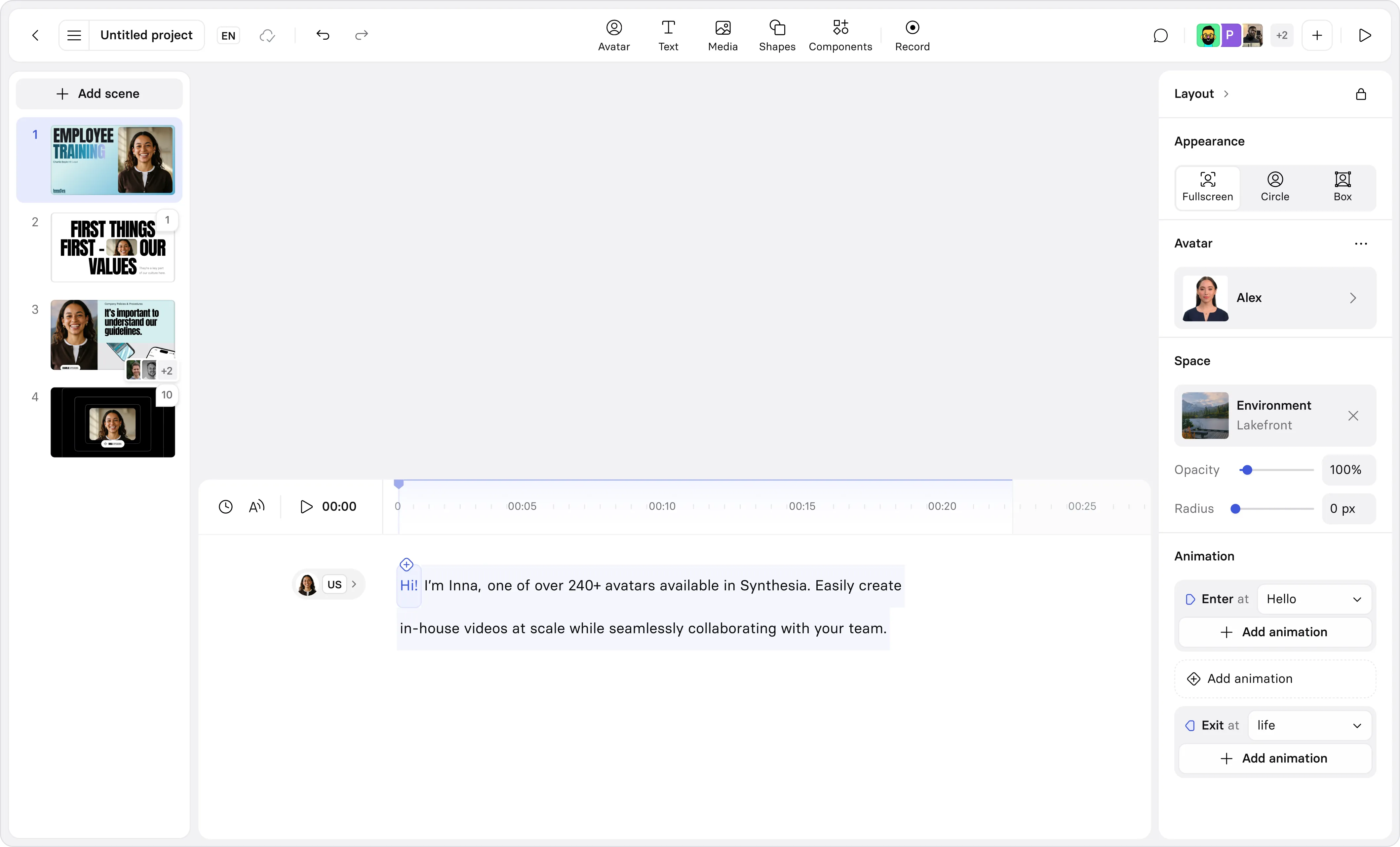
3. Use templates
If you're not an expert designer (I'm not either), then using video templates can be one of the lowest-hanging fruit for making your videos more engaging.
Making a video involves what feels like thousands of little design decisions on pacing, layout, typography, animations, and scene structure which accumulate as you work on your project. If you make a lot of wrong decisions, the end product will show it.
I like using professionally made video templates because it takes away a huge number of those design decisions, allowing you to focus on your goal, your audience, and your message.
Video templates also give you built-in scene diversity, which is an important best practice for making engaging videos.
Check out this video template below and you'll see what I mean — it gives you a really solid framework upon which you can create an engaging video quickly and easily.
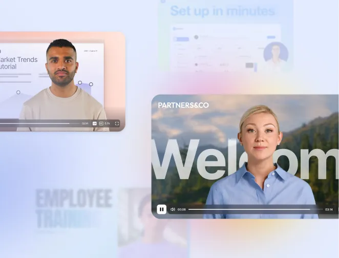
4. Use striking imagery and visuals
We are all naturally drawn to great visuals, and the human brain processes images 60,000 times faster than text, so the visual layer of a video has a huge impact on how people feel and what they remember.
Visuals I regularly use include simple animations, motion graphics, B-roll, screen recordings, and AI presenters. They all have a part to play in communicating ideas while keeping your video engaging.
I've found the key to an engaging video is in how you mix them together. Obviously some videos won't need a screen recording, and other videos won't need a presenter, so you'll need to think about which style suits your video best.
In one video I might let an AI avatar speak directly to my audience in the first scene, then I'll cut to a second scene where I explain the concept in more detail with a motion graphic.
While choosing my visuals, I'm always thinking about how color and contrast can help guide the attention of my audience and create the emotion I'm looking for. You should try to make your visuals pop.
5. Audio quality matters more than visuals
This might seem counterintuitive given what I just said in the last section, but bear with me.
Bad sound can kill your video's engagement faster than any other production quality issue, so try to avoid the obvious mistakes.
I suggest recording your audio in a quiet space with minimal background noise and soft furnishings (to reduce any annoying echo), and try to keep your microphone about 6 to 8 inches from your mouth.
If you're generating narration using AI voices, then you need to be extra careful of any pronunciation issues, as that can turn users off pretty quickly, and take extra care if your video contains any technical terms or non-English content.
One last tip, and this is an important one, please don't ruin your video with annoying or overly loud music. I always recommend picking subtle and calming background music that will add some energy to your video without distracting viewers from your video content (I suggest around -20 LUFS).
6. Tell a story with your video
If you want to make your video as engaging as possible, you'll need to harness the power of storytelling.
The best storytelling I've seen in videos always follows common patterns:
- They're believable: Your viewers should find your story realistic and easy to trust.
- They're relatable: You want your storytelling to be relatable to the people and places in your target audience's lives so that they'll identify with what they are seeing.
- They entertain: Your story should be funny, interesting, and unpredictable.
- They teach a soft lesson: Your story should leave your viewers with a valuable message without sounding preachy or annoying.
- They're memorable: Your storytelling needs to stand out by being inspiring, funny, or notable in some other way.
- They have a clear structure: The best storytelling typically starts with a clear beginning, middle, and end and usually incorporates some kind of tension or conflict.
Storytelling can mean different things depending on your video type, and obviously you need to fit this to your video type. You're probably not trying to win an Oscar with a social media video.
If you're making a training video it might mean wrapping technical information that you want your learners to absorb within a common real-world scenario, or if you're making an explainer video it might mean telling a funny story of a person who has the same pain point as your target audience.
7. Evoke emotion
Evoking emotion in your viewers is another great way to create engaging videos.
If you can get your viewers to feel connected with your video, they will become emotionally invested and keep watching as they seek a satisfying conclusion.
One way to evoke emotion is by using emotive words in your video script, but your choices in music, color palette, environment, and the overall style of your video can all evoke emotion too.
Another big emotional lever you have is who you choose to include in your video. Different actors can elicit different states of mind:
- A CEO can narrate a brand story in an explainer video and inspire confidence.
- An employee can share a work-related experience and inspire trust.
- A customer can show up in a video testimonial and encourage authenticity.
You can use basic emotions like humor, sadness, excitement, fear, anger, happiness, or even playfulness to get viewers on your side with the use of emotional hooks.
Some examples of common emotional hooks used in videos include:
- There must be a better way.
- I know a secret others don't.
- You'll never guess what happened next.
- This won't last so act before it's gone.
- Imagine who you could become.
- It's us vs. them.
Try using some of these hooks in your video's opening 10 seconds and see if you see an improvement in your video's engagement metrics.
8. Hook your audience from the start
The opening 5-to-10-second section of your video that I just mentioned in the previous point is called the hook, and it's absolutely essential that you get it right if you want your video to be engaging.
The general principle that I want to get across is that you need to be proving value as quickly as possible.
In my experience, the most effective hooks follow a simple two-step pattern of showing the viewer the outcome (which is what they'll learn by watching your video) and then quickly following that up with the proof (which is a small payoff or escalation so that the promise feels real to the viewer).
I recommend writing the script for your hook before anything else in your video, and I like including a surprising statistic, a direct question, or some kind of bold statement to set the tone and capture my audience's attention immediately.
I really wouldn't recommend filling your hook with logos or introductions. You should lead the early sections of your video with your most punchy content, and save the less attention-grabbing stuff for later in the video once you feel that you've earned the viewer's trust.
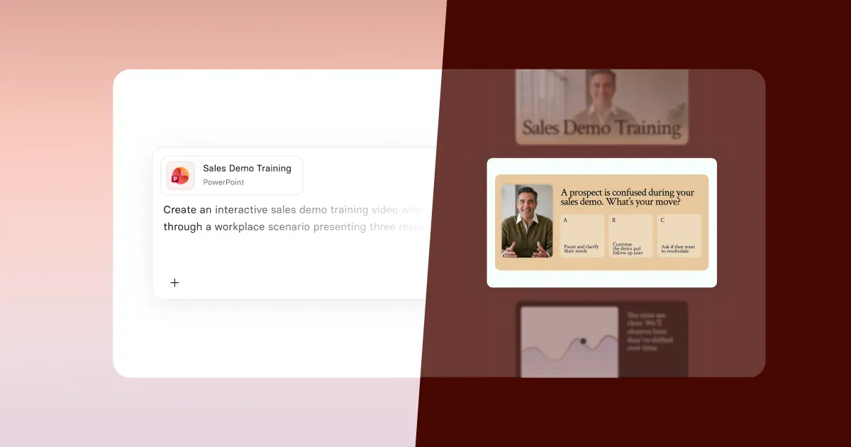
9. Add meaningful interactions
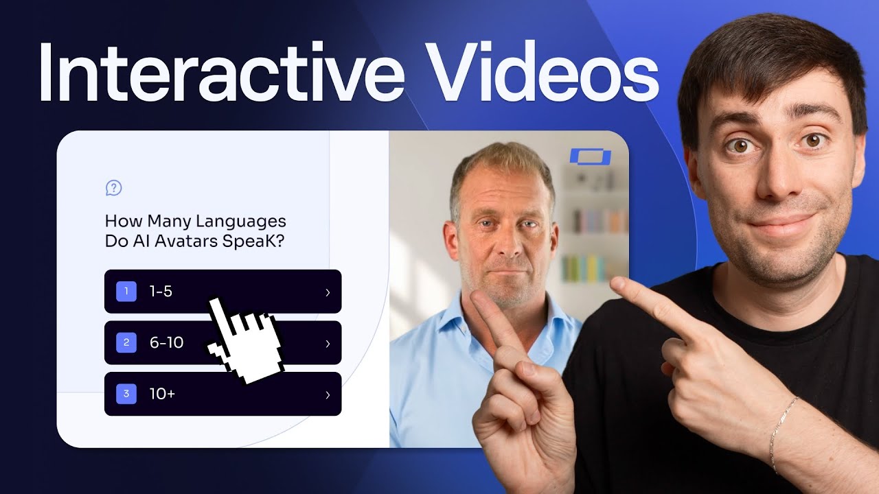
Adding interactivity to your videos can help you to reduce drop-off rates, increase your average watch times, and keep your viewers engaged.
Branching scenarios, clickable buttons, links, quizzes, checklists, and anything that requires viewers' active participation will help them feel more immersed and committed to completing your video and putting it to use.
Take this study as an example. It found that interactive video beats normal video in a controlled study with learners enjoying a +6.49-point lift on the study’s test metric and also significantly higher learner satisfaction scores.
If one of my videos is struggling with low completion rates, poor viewer knowledge retention, and dropping engagement, then that's where adding some interactive features can be really transformative.
10. Be genuine
Letting your video show some genuine personality can help you to earn your audience's trust, which is crucial if your viewers are going to be receptive to your video's message and take the actions that you want them to.
I'd actually go as far as to say that authenticity and relatability are more important than having a highly polished video.
I think the key thing to understand is that different personalities attract different types of audiences, so it's best to just be yourself and show your personality in your video rather than rely on highly rehearsed delivery. My view is that perfection can often get in the way of connecting with your audience.
Some of my most successful videos have been the ones where I showed a process, shared my mistakes, and tried to convey my genuine enthusiasm for the topic and helping people. That authenticity can be irresistible.
I try to tell personal stories, share my experiences, and give candid and behind-the-scenes insights, while at all times avoiding anything that feels overly scripted.
If you're creating videos with yourself as the presenter, tell personal stories, experiences, or behind-the-scenes insights, and try to avoid rehearsed delivery and let your natural personality shine through.
Another great step you can take is to actively engage with your audience by responding to comments, addressing feedback, or incorporating user-generated content.
Kyle Odefey is a London-based filmmaker and Video Producer at Synthesia. His content has reached millions across TikTok, LinkedIn, and YouTube, even inspiring an SNL sketch, and has been featured by CNBC, BBC, Forbes, and MIT Technology Review.

.webp)

.webp)