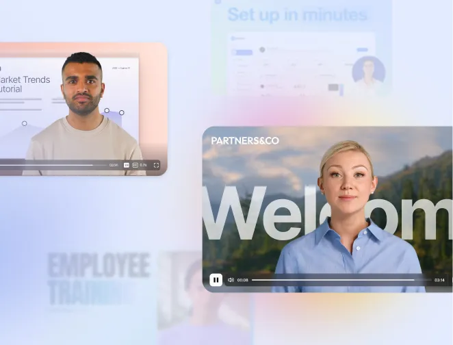


Create AI videos with 230+ avatars in 140+ languages.
Custom tagline
Want to make engaging interactive training videos? Here's one I made with Synthesia that walks you through the process step-by-step.
If you don't want to watch the video, you can follow the steps here.
Note: If you've already got training materials (in a PDF or PowerPoint slides, for example) you can also use Synthesia to convert them to an engaging training video.
Step 1: Plan your training video
Before diving into video production, establish a clear foundation for your training video by answering two key questions:
- Who is this video for? Understand your audience deeply. Consider their demographics, job roles, interests, and challenges. Talk to your audience to gather insights.
- What do you want them to do after watching? Define a specific, observable action you want your viewers to take.
Once you’ve planned your goals, focus on organizing your content to deliver the message effectively:
- Choose one topic: Narrow the focus of your video to one specific subject to avoid overwhelming viewers.
- Use up to three examples: Reinforce your message with clear, relevant examples to make the content memorable.
- Create a compelling hook: Grab attention at the start by asking a thought-provoking question or presenting an interesting fact that connects to your audience’s prior knowledge.
Following these steps ensures your content is structured logically and is aligned with your goals.
Based on Synthesia's internal data, defining 1–3 specific learning objectives per video leads to higher retention and completion rates.
Step 2: Write a training video script
An effective training video requires a well-written script. Here’s my framework for writing an engaging training video script:
- Introduction: Clearly state the video's purpose and what viewers will learn. For example, begin with, "In this video, you'll learn how to..."
- Explain the importance: Highlight why the topic is relevant to engage viewers and emphasize the value of the information.
- Provide instructions: Deliver step-by-step guidance on the subject matter, ensuring instructions are clear and concise.
- Offer examples: Use relevant examples to illustrate key points, enhancing understanding and retention.
- Interact with the audience: Adding small quizzes to your training video can improve information retention and keep viewers engaged.
- Summarize key points: Recap the main takeaways to reinforce learning and aid memory retention.
- Call to Action: Encourage viewers to apply what they've learned or direct them to additional resources for further learning.
I try to write my script in a conversational tone and avoid jargon and complex language.
For example, I’d simplify phrases like "Remaining vigilant in the face of cyber threats is critical" to "Clicking weird emails is bad”. If you need inspiration then check out our tips for writing training video scripts.
Be sure to break your script into 2-3 sentence chunks to keep the pacing fast. Each of these chunks will correspond to a scene in your training video - I usually aim to change scenes every 10 to 20 seconds to keep my viewers interested.
If you don't have time to spare for the script writing process, check out our handy training video script templates.
Step 3: Log in to Synthesia
Click here to log in or sign up for a free account.
Step 4: Create your training video
In this step you would typically film the video using equipment like cameras and microphones, but I’m going to show you how you can easily create professional-looking training videos with Synthesia - which will convert your video script text into an AI video.
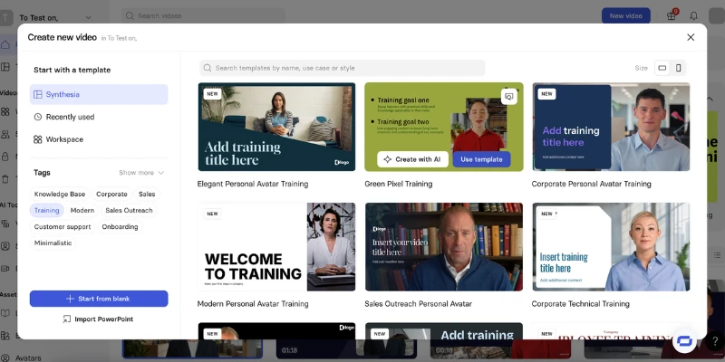
A. Choose a training video template
Video templates eliminate the need for design skills and significantly speed up the process.
Synthesia has 60+ training video templates to help get you started with your training video creation: anything from microlearning video templates, scenario or setting-based templates, and even storyline-specific templates.
You can see all of the training video templates in your Synthesia dashboard by going to 'Templates' and clicking the ‘Training’ tag.
B. Add your scenes
Click the ‘Add scene’ button on the left to see the various layout options that come with your chosen templates.

You might want to start by adding the following scenes:
- Introduction scene:
- A presenter introduces the topic. This scene normally includes the company logo, the video title, and some engaging visuals.
- Objectives overview:
- A clear summary of learning goals with some text or graphics listing objectives.
- Step-by-step demonstration:
- The process or concept broken into actionable steps, often with screen recordings, close-ups, or text highlights.
- Real-world scenarios:
- Role-playing or on-the-job examples with text overlays summarizing key actions.
- Explainer segment:
- Animated diagrams, flowcharts, or whiteboard visuals including definitions with keywords highlighted.
- Quiz or interactive activity:
- Questions or tasks to test understanding. This scene could include interactive prompts or timers (if applicable).
- Recap and key takeaways:
- A summary of the main points. I like to include a checklist or text graphics here for reinforcement.
- Call to action:
- Here you should encourage the application of the learning or next steps. You might want to include links or contact details.
- Closing scene:
- A “Thank You” message with branding.
C. Choose a presenter
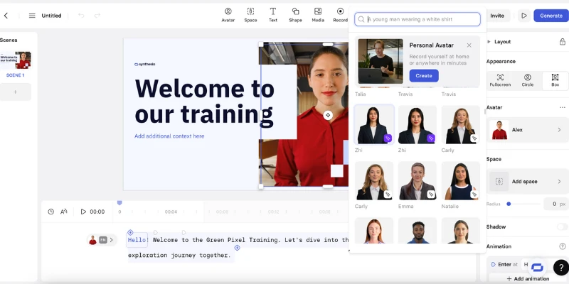
To change your training video presenter, simply click on your current presenter and then find ‘Replace Avatar’ on the right hand side of your screen.
You’ll be shown a range of over 230 realistic talking AI avatars to choose from. Try to pick the one that best suits your training video topic.
You’ll also see an option to create a personal avatar. This option allows you to be the presenter of your training video - all you need to do is record a short video from your laptop or smartphone.
D. Add your script
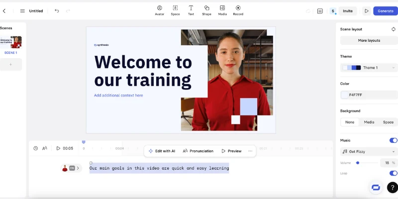
Since we’ve already divided our script into 2-3 sentence chunks, now we just need to copy and paste each chunk into the corresponding scene’s script box at the bottom of the screen.
E. Add screen recordings
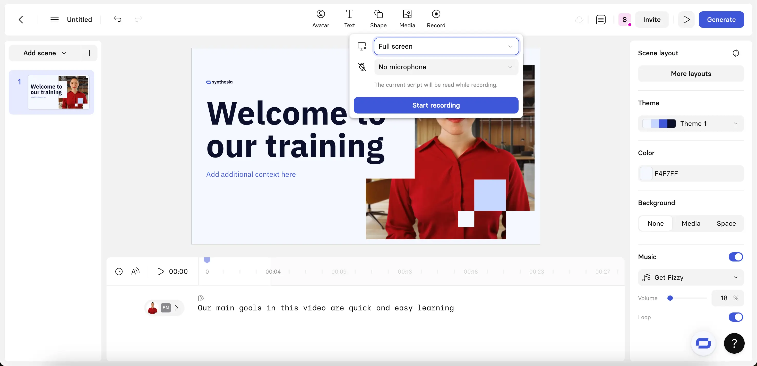
You can add screen recordings by clicking on the ‘Record’ button on the top navigation bar. You can record your entire screen, a specific window, or a specific browser tab.
You have the option to either record a voiceover with your microphone, or have a pre-written script read aloud from your scene to guide your actions and timing as you record.
F. Add interactivity
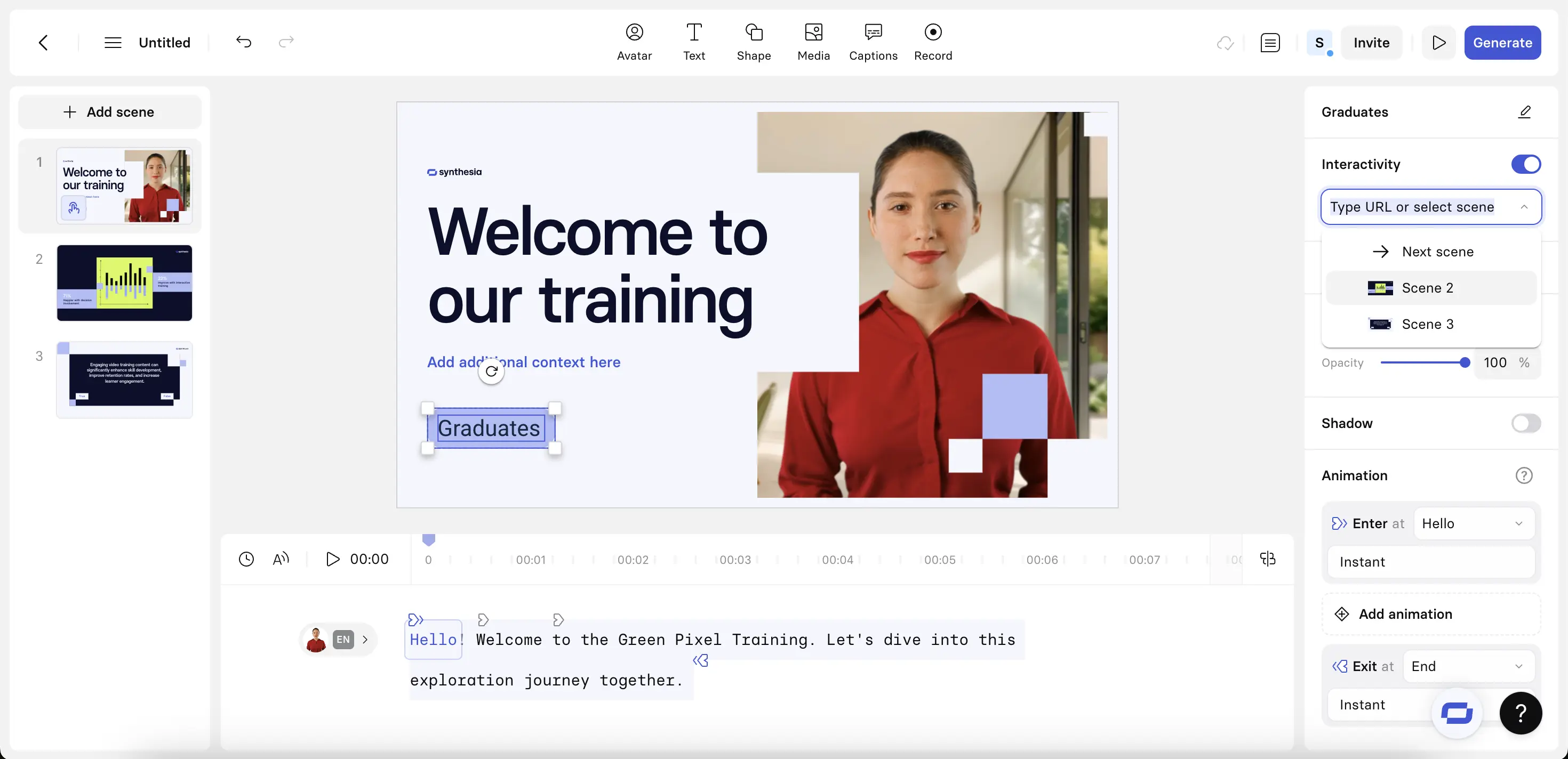
Synthesia's interactivity features allow video creators to convert text and shape elements into clickable buttons.
You can choose an action for the button click to trigger. These buttons can open a URL in a new browser tab or jump to another scene within the video—enabling non-linear, "choose-your-own-adventure" experiences.
To create a clickable button, select an element and then enable interactivity in the inspector panel on the right. Select 'wait for click' to pause the video until a viewer interacts with the button.
I like using these interactivity options to create quizzes, add branching scenarios, and to link to additional resources.
Step 5: Edit your training video
Now that you have a visual outline and the narration, let's get into the editing process.
Here are some things I’ll add to my training video to help visualize the ideas I’m trying to communicate:
- On-screen text
- Images, video clips and diagrams
- Animations and transitions
Some tips when adding these elements:
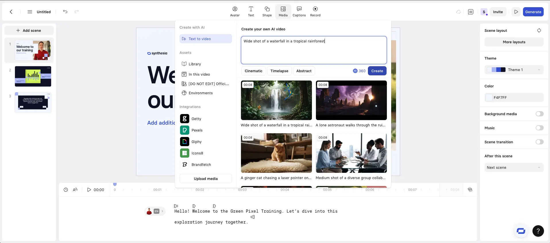
- You can add custom media by clicking on the ‘Media’ button on the top navigation bar
- You can generate AI video clips from text prompts and then add them to your training video
- It’s best to use single sentences for on-screen text
- Remember that it’s hard to read and watch video at the same time
- You can animate anything by clicking on it and then finding the animation options on the right hand side of your screen
Step 6: Generate your training video
Generate your finished video by clicking on 'Generate'.
Synthesia will take a few moments to animate the avatars, check that the content passes our moderation guidelines, and perform some general AI magic to make a great training video for you.
After your training video is generated, you can download the video file and share it. Here are some of the available options for sharing your video:
- You can download your video as an MP4 file
- Download the subtitles for your video in SRT format
- Publish your video and share or embed the link
- Export your content as a SCORM package for use in an LMS/LXP
The benefits of using video for training
1. Higher engagement and easier information consumption
Most employees retain information better when it's presented visually.
A survey by Synthesia showed that 97% of respondents found video effective for knowledge retention. Personally, I've observed this trend most strongly with new hires, who often revisit video tutorials over written materials for quick refreshers.
Another example: BSH experienced over 30% increase in engagement with their e-learning videos, compared to text-based e-learning modules and PowerPoints (see case study).
2. Cost savings
I’ve seen companies save a lot of money by replacing in-person training events with reusable training videos.
One example of this is Microsoft, who showed a 95% reduction in L&D expenses after launching an internal video portal, cutting costs from $320 to just $17 per employee.
The cost savings can be even greater when a company uses AI to generate their training videos, as you save money on video production, actors, editing and translation:
- Zoom's instructional designers cut 90% off their video creation time – from days to hours, compared to traditional video creation methods by switching to Synthesia (see case study).
- Berlitz produced over 1,700 micro-videos in just six weeks with Synthesia, achieving a 70% reduction in production time and cutting costs by 66% (see case study)
3. Simplified maintenance
Another huge advantage of using AI video generation platforms for training videos is that it’s easy to go back and update existing video content, modify or add information.
AI lets me keep my training content fresh without the expense of re-shooting all of my training videos.
When does it make sense to use a training video?
There are plenty of scenarios where a training video can be a game-changer, helping you communicate information clearly and efficiently.
Here are some ideal situations where video makes the most impact:
- Onboarding new employees or clients: A well-crafted video can streamline the onboarding process, ensuring new team members get up to speed quickly. It can also serve as an engaging introduction for clients, setting the right tone for your working relationship.
- Launching a new product or software: A training video can help reduce the learning curve by walking users through key features and functionalities. Instead of relying on dense documentation, a concise video can make adoption seamless.
- Ensuring consistency across teams: For example, a marketing department might use a video to outline brand guidelines, providing clear do’s and don’ts to keep messaging and visuals aligned across all campaigns.
- Scaling training efforts efficiently: Instead of repeating the same session for every new hire or team, a video allows you to record the content once and distribute it as needed.
- Building a knowledge base of self-serve resources: Training videos are perfect for creating an on-demand library of tutorials, covering everything from getting started with a platform to advanced feature usage.
- Explaining concepts quickly and effectively: If you find yourself answering the same questions over and over, a short video can be a time-saver.
10 tips for effective training videos
Keep your videos short and sweet
One of my biggest lessons came from a 20-minute video that learners consistently skipped halfway through.
I broke it into five shorter segments, each focusing on one topic. Completion rates soared, and feedback improved because learners felt they could consume content at their own pace.
There's a lot of research that supports the effectiveness of shorter videos, such as this analysis that found a significant drop-off in viewer attention around the 6-minute mark, indicating this might be a threshold for engagement.
Define clear learning objectives
In my L&D experience, a successful training video starts with clarity about what learners should walk away knowing or doing.
If I’m designing a leadership training module, I’ll focus each video on one competency (e.g. giving feedback), ensuring every tip supports that single goal
Understand and tailor to your audience
I like collaborating with SMEs (subject matter experts) to create variations of training videos, tailoring them to different audience groups for maximum engagement
Choose the appropriate format and style
I’ve found "talking head" videos with role-play scenarios to be the most versatile training video type, as learners resonate better with real-life interactions
Incorporate human elements
While developing onboarding videos, I added AI avatars of each of the team members introducing themselves.
New hires appreciated this "human touch," which made them feel connected to their colleagues even before meeting in person
Vary visuals to sustain interest
Static PowerPoint slides result in learners tuning out. By integrating animations, video, and interactive hotspots in our revamped videos, we saw a significant increase in knowledge retention, as confirmed by post-training assessments
Craft concise introductions
I learned the importance of brevity when learners gave feedback like "The first two minutes were just fluff." Now, every video opens with a brief, 10-second introduction answering two questions: "What is this about?" and "Why does it matter to you?"
Incorporate interactive elements
I like embedding scenario-based questions at key moments in a training video. These questions make the audience pause, reflect, and apply the concepts in real-time, rather than passively consuming content
Ensure multi-device accessibility
I’ve noticed a steady increase in mobile usage for e-learning platforms. By ensuring videos are mobile-friendly—using responsive design and clear, large text—I’ve seen higher participation rates, especially among field employees who learn on the go
Regularly update content
I like to schedule biannual reviews of all training videos to update outdated visuals or adjust content to reflect the latest processes and technologies
Which training video software should you use?
If you want a more detailed look at the best tools for making training videos, check out my in-depth guide to training video software.
Here I’ll give you the TLDR version:
- For talking head/presenter training videos: Synthesia
- For screen recording videos: Camtasia
- For interactive training videos: Learnworlds
- For animated training videos: Vyond
- For editing recorded footage: Adobe Premiere Pro
You might also want to check out my guides to eLearning authoring tools and employee training software.
What are the different types of training videos? (+ examples)
When it comes to eLearning video production, the format and style play a crucial role in determining their effectiveness.
Different styles suit different learning objectives, making it important to choose the right one for your audience.
Here’s a breakdown of the most common types of training videos, each tailored to specific use cases and goals.
By style
- Talking head videos: Presenter speaking directly to the camera
- Animated videos: Use of 2D/3D animation to simplify complex concepts
- Screencast videos: Screen recordings made with screen capture software combined with voiceover instructions
- Live-action videos: Real people performing tasks or providing instructions
- Interactive videos: Interactive videos typically include clickable elements for viewer engagement
- Role-play videos: Simulations of workplace scenarios
- Testimonial videos: Featuring feedback or experiences from peers
- Gamified videos: Game elements to engage learners
- Whiteboard videos: Hand-drawn illustrations appearing in real-time
By content type
How-to videos:How-to instructional videos are step-by-step guides for specific tasks, breaking down processes into easy-to-follow steps for clarity and effectiveness.
These videos are ideal for teaching users how to perform new actions, from setting up software to crafting DIY projects.
Onboarding videos: Introduction and orientation for new employees or users, helping them understand the organization’s mission, tools, and workflow.
These videos set the tone for a welcoming experience while providing essential information in a structured way.
Compliance training videos: Cover legal, safety, or regulatory requirements, ensuring employees understand critical policies and avoid potential risks.
These videos often include interactive elements or quizzes to confirm comprehension and adherence.
Product training videos: Demonstrations or tutorials for using products, explaining key features, and offering troubleshooting tips.
They’re particularly effective for customer education and internal sales teams needing in-depth product knowledge.
Soft skills training videos: Focus on communication, teamwork, and leadership, helping employees improve interpersonal relationships and collaboration.
These videos often include role-playing scenarios or storytelling to reinforce critical lessons.
Technical skills training videos: Detailed instructions for job-specific technical tasks, such as programming, engineering, or data analysis.
They ensure precision and are often used to upskill employees in fast-evolving industries.
Sales and customer service training videos: Teach best practices for dealing with clients, focusing on enhancing customer satisfaction and achieving sales goals.
These videos often simulate customer interactions to train employees in real-life scenarios.
Health and safety training videos: Guidelines for workplace safety and well-being, covering topics like emergency procedures and hazard prevention.
These videos are crucial in industries where safety is a top priority.
Diversity and inclusion training videos: Promoting cultural awareness and inclusivity, fostering a respectful and understanding workplace.
These videos often feature stories and scenarios to highlight the importance of diversity.
Leadership development videos: Focused on management and executive training, providing insights into effective leadership strategies and decision-making.
These videos often include advice from experts or real-life case studies.
Scenario-based training videos: Simulated real-world situations for problem-solving, allowing learners to practice skills in a controlled environment.
These videos are particularly effective for high-stakes or complex tasks.
Real-world examples of training videos made with AI
Thousands of companies have transitioned from traditional video production to AI-powered solutions for creating corporate training videos.
Here are 5 real-world examples of training videos produced with Synthesia.
Example #1: WPP
WPP is a world-leading marketing services company dedicated to helping businesses and brands build better futures by addressing the challenges of modern marketing.
Here’s an example of a training video they developed with Synthesia to demystify AI for their 50,000 employees.
Example #2: Collibra
Collibra, a data intelligence company, utilized Synthesia's AI video platform to enhance its customer training initiatives.
This adoption led to a 50% reduction in video production time, enabling the creation of over 100 training videos and the development of more than 30 self-serve courses within six months.
Example #3: Criteo
Criteo revamped its employee onboarding by using Synthesia's AI video platform, enabling the creation of 50 training videos in under six months.
This streamlined approach reduced production time, ensured consistency, and enhanced engagement, aligning with Criteo's high-tech identity.
Example #4: Antisel
Antisel, a Greek scientific equipment and services company with over 200 employees across three markets, has embraced the needs of its growing remote workforce.
To welcome new team members, the company uses Synthesia to create personalized, AI-generated training videos.
These bite-sized onboarding videos are customized for each employee and translated into four languages to cater to Antisel's international workforce.
Here’s an example of an onboarding video created for a new employee, Christos:
Example #5: Dixa
Dixa, a Danish omnichannel customer service software provider, aimed to enhance its client onboarding by developing video-based training materials.
Traditional video production posed challenges, including lengthy creation times, inflexibility, scalability issues, and high costs.
By implementing Synthesia's AI video platform, Dixa's Academy team streamlined their process, producing over 75 training videos within a year—completing each in one-third the time compared to traditional methods.
This efficiency led to a course completion rate exceeding 95%, significantly improving the onboarding experience for customers and agents.
For more inspiration, check out these case studies of companies using Synthesia to produce engaging training videos quickly and easily:


You might also like


Frequently asked questions
What is a training video?
A training video is a video that educates the viewer on a topic and/or teaches a new skill. Training videos can be separated into two types: employee training videos and customer training videos.
For example, an employee training video can be used to introduce new employees to company policies and procedures, provide refresher training for experienced staff, or teach specialized skills, such as safety procedures or customer service techniques.
In this blog post, we're focusing on training videos for employees.
How long should a training video be?
The optimal length for a training video varies based on its nature, according to different studies.
Research on online instructional videos has shown that engagement rates are highest for videos of six minutes or less.
Meanwhile, for software instructional videos geared towards microlearning, the ideal length is suggested to be 60 seconds.
However, the most critical factor is to ensure the training video provides necessary information concisely without overwhelming the learner, regardless of whether its duration is one minute or six.
What should be included in a training video?
How you make a training video and what you include in there depends highly on the topic and type of training video.
The content of the video will depend on the topic and your company policies, as well as any relevant laws. If we disregard the legalities, the best tutorial videos mix educational content with engaging visuals and a touch of humor.
So include everything that is legally necessary, that applies to your company and its policies, and sprinkle a touch of personality and humor to make the video engaging to watch.